Luke’s Locker Window Display
Visual Merchandising
Eve Nicols, a distinguished Senior Lecturer in Fashion, once told me,
“Visual displays are like a play…you have your actors, set, stage, supporting actors, and the script.”
I’ve carried that with me since and I believe it holds true to all types of design. You want your piece to tell a story that can be clearly seen by your audience
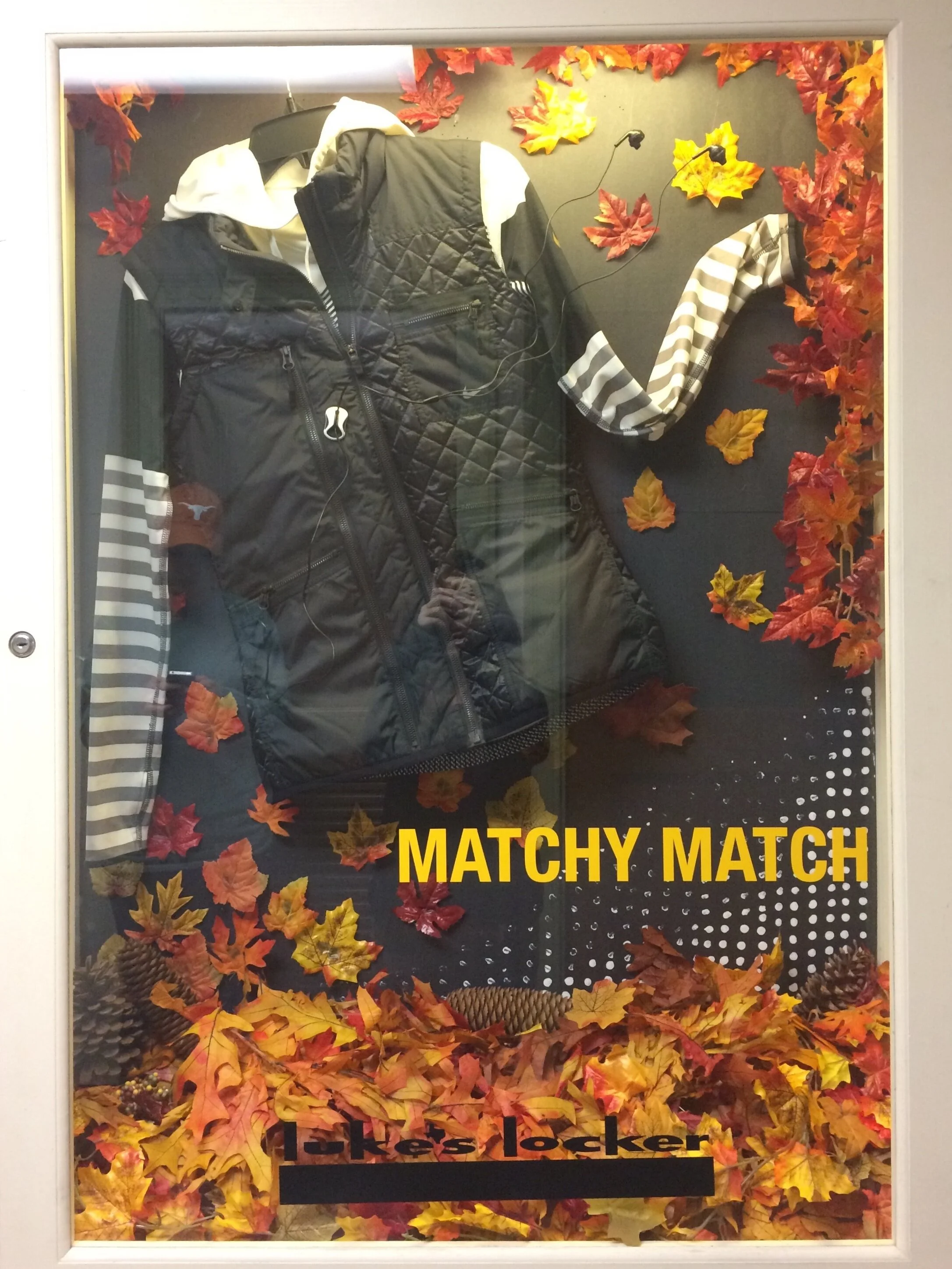
A well-produced window display can tell the most captivating story. As part of a Visual Presentation course at UT, I had the opportunity to do just that.
The Play.
The task? Creating a professional window display for my chosen vendor, Luke’s Locker in Austin, a Dallas-based running and fitness store.
The Script.
The display needed to be both inspirational and relevant to the retailer’s target customer. The image that came to mind was a woman, hair flowing in the autumn wind as she ran on a path covered by colorful maple leaves; the reds and golds contrasting beautifully against her monochromatic Luke’s Locker ensemble. If I played my cards right, the display would inspire people to run even through the colder months of fall.
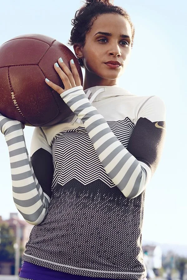
NIKE Pro Hyperwarm Engineered Print Hoodie
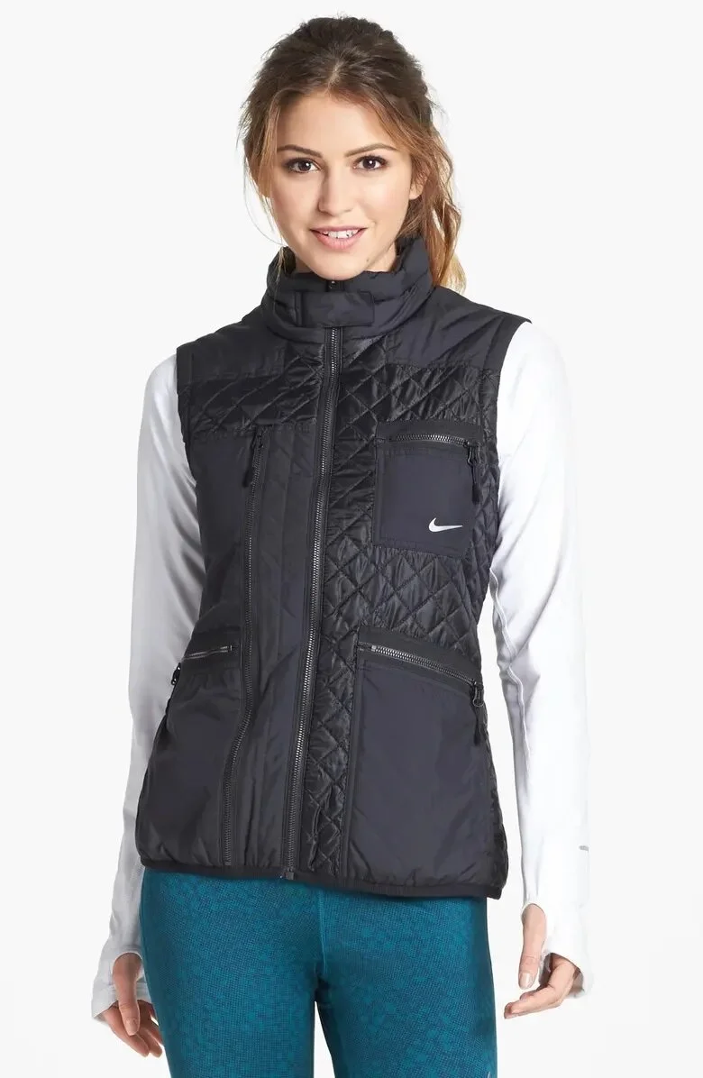
NIKE 'LA84' Primaloft Dri Fit Vest
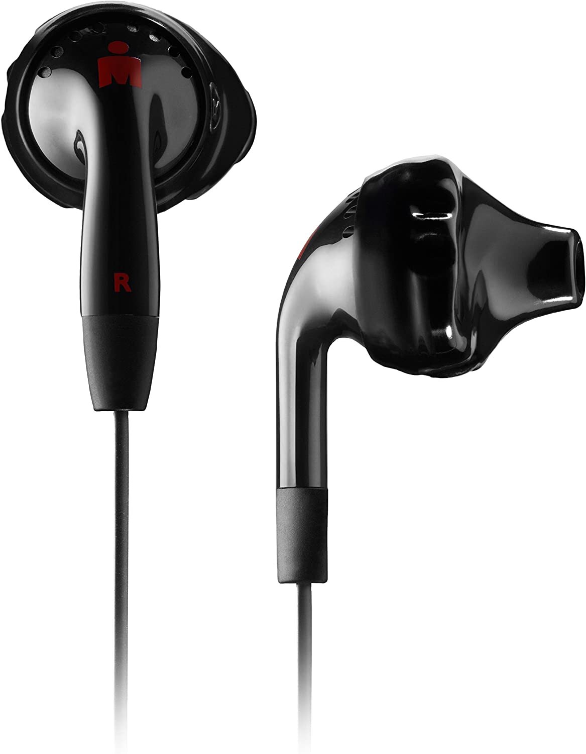
Yurbuds Inspire sports earphones
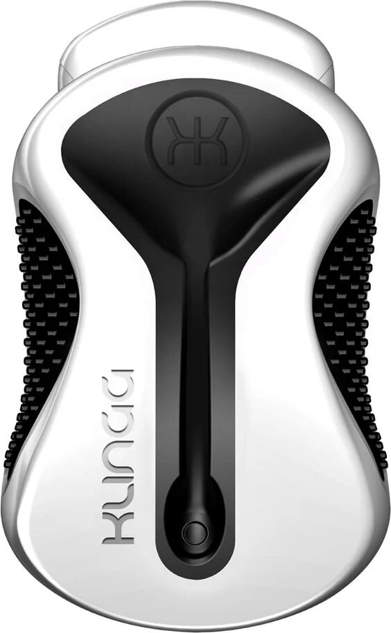
Klingg earphone magnet
The Actors.
I contacted and cultivated a relationship with the manager and was lucky enough to be able to choose any merchandise that caught my eye (something I am extremely grateful for). After analyzing my fixed budget and gathering my carefully selected pieces, I put together an inspiration board to plan out my ideas and sketch out the final product.
I began working on bringing my idea to life. Through this journey, I ran into some challenges and considered how to improvise. The biggest challenge was trying to come up with a way to incorporate movement into the piece without filling the merchandise like I originally intended while staying within budget. The window wasn’t deep enough to use a filler, so I positioned the garments in a way that implied movement and hung the earphones as though they were ‘flying in the wind’.
The Supporting Actors.
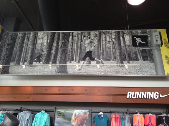
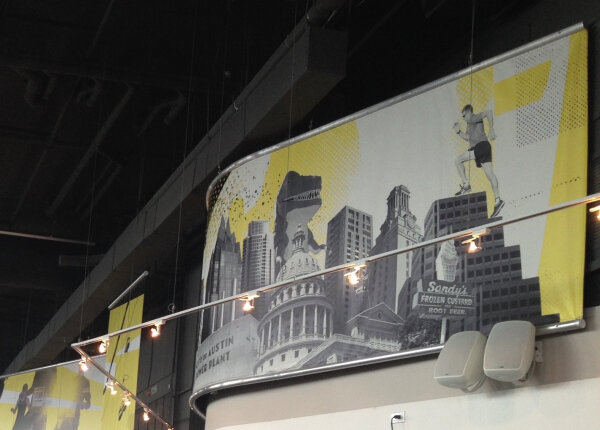
During my time researching the client and visiting their store, I noticed that many of their signage and posters contained halftone patterns in them. To further integrate the retailer’s brand image into the display, I crafted a black-and-white halftone background. In turn, the background lent itself to furthering my vision. Using prop maple leaves in bright and warm colors, I achieved the image in my mind by staging them so their vividness would contrast against the grayscale merchandise and background.
In the end, the final product turned out to be much better than how I had originally planned to set it up. It was one of the most enjoyable learning experiences during my time at the university. Eve Nicols even commented saying it was her favorite display of the class, and the most professional. Crazy cool!
See the finished display above!