Heartfelt Days Retail Store
A Capstone Project
What the Capstone Project entailed:
A fictional opportunity to become the new owner of a 1200 sq. ft. brick-and-mortar store in a midsized to large metropolitan area. Creating and developing a retail store for the space that clearly communicated a brand image. Presenting the completed project on a storyboard to a seasoned professional in retail design.
The first step in creating my retail store was brainstorming and research. I looked for current retail trends; thought about what I wanted my store image to portray and how I wanted my target market to respond to it; and what would set me apart from my competition. While brainstorming, I recognized a growing design trend of “back to nature” through reclaimed and handmade products as well as a societal trend of being in touch with one’s self and the world around you.
With these trends being inline with my own views, I decided on the following:
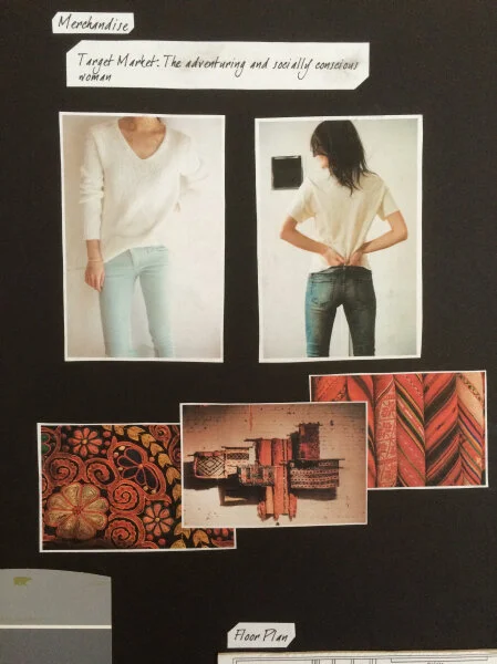
Merchandise type: Women’s wear and a variety of cultural, global textiles.
Mission statement: “To obtain captivating textiles and create tailored clothing that inspire women to travel the world while giving back to society’.
Target market: Women ages 20-60; middle class with any occupation and education; an annual income of $60,000 to $95,000; and an adventuring and socially conscious lifestyle.
I wanted as many people as possible to be able to afford my merchandise (with a few exceptions like couture apparel constructed from exquisite textiles or the textiles themselves). The merchandise being sold was to be well-crafted, staple clothing in neutral colors with the textiles from around the world being the main “interest” factor of my store.
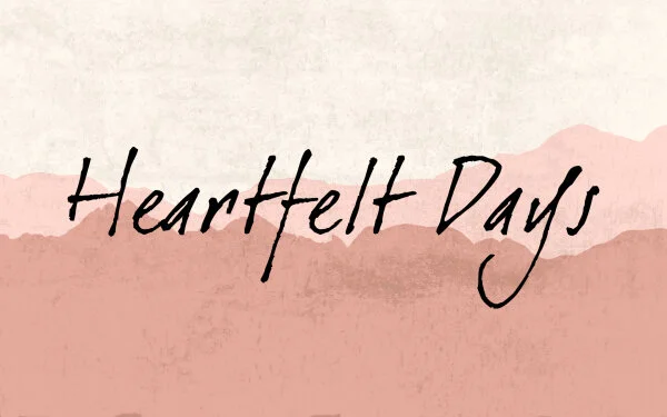
Store Name and Logo.
It was critical that both the brand name and logo communicate the store image and mission to my customers. I chose “Heartfelt Days” so that even hearing the store’s name would trigger a strong feeling and desire to act within someone. Using Photoshop, I designed a logo that would both convey that sentiment and that of wanderlust. I placed mountains in the background of a handwritten-like font and gave the overall logo a light, warm pink color and a slightly weathered texture.
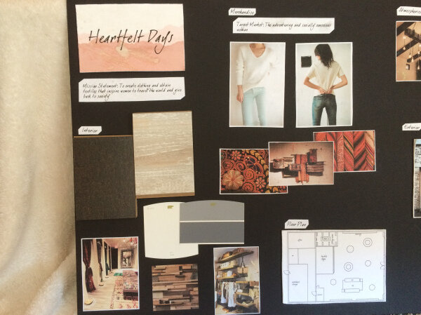
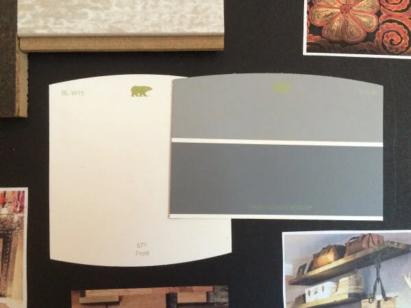
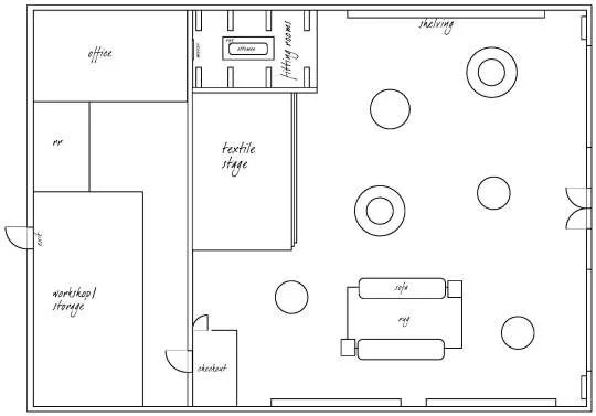
One of my “must-haves” was a free-flow layout for the store’s interior. Like its brand story, I wanted the layout of the store to give customers a sense of freedom and adventure (allow the customers to choose where they want to go and discover the store for themselves) without having to leave. Another necessity was a stage towards the back of the store to display the beautiful, colorful textiles I would have collected from around the world. The other physical aspects of the interior, like wall color and flooring, I designed to have a reclaimed feel.
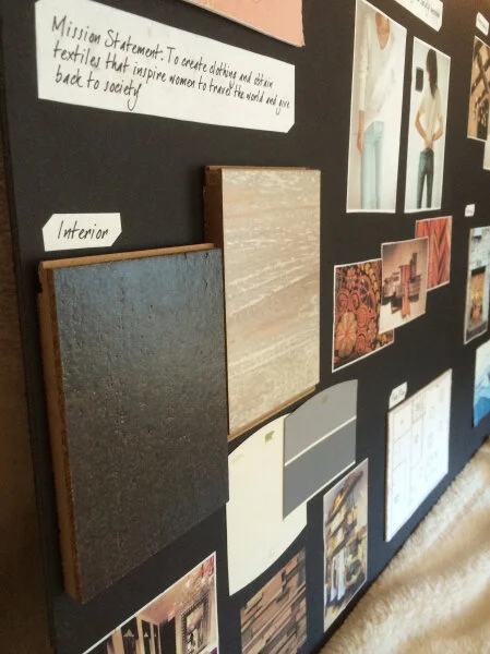
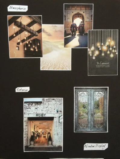
Perhaps one of the most important parts of any store’s image is the atmosphere it provides for its customers. Heartfelt Days needed to be inviting and comfortable while keeping its up-cycled, chic feel. Warm lighting through industrial Edison-style light bulbs, fresh inviting scents like gardenia and eucalyptus, and feel good indie and alternative music were the kind of atmospherics that would tie the overall brand image together.
The last step was figuring out how I was going to differentiate Heartfelt Days from another retail store if they had a similar concept. What else could I offer my customers? Experiences! Potential opportunities I came up with were hosting multiple events like a presentation on how to backpack on a budget, outdoor activities such as hiking and other excursions, and info sessions about where I get my textiles and how our company makes a difference locally and around the world (how we help/our cause/contribution to society).
Grand-opening time!
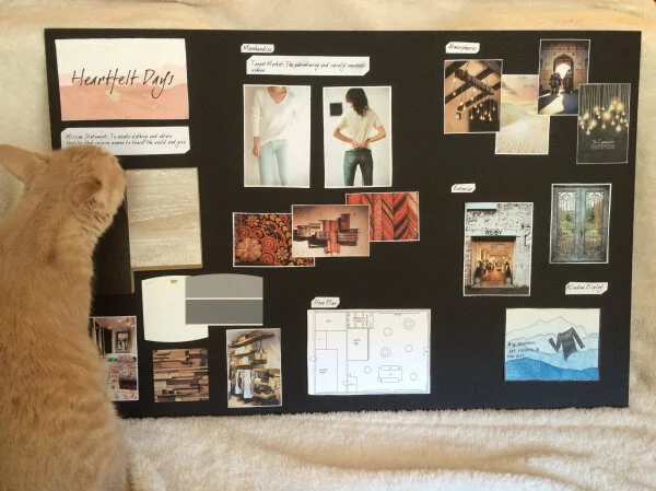
After putting my storyboard together, it was time to reveal my finished store! See the completed storyboard below (cat not included).